ACE INDUSTRIES
CASE STUDY

Rebrand
Ace Industries, an industrial overhead crane manufacturer felt their main problem was their poor presentation to customers. Without any prior marketing resource, the primary ask was to make their company look credible. As a 90 year old, 3rd generation run company with a rich history, they also wanted someone to tell their story.
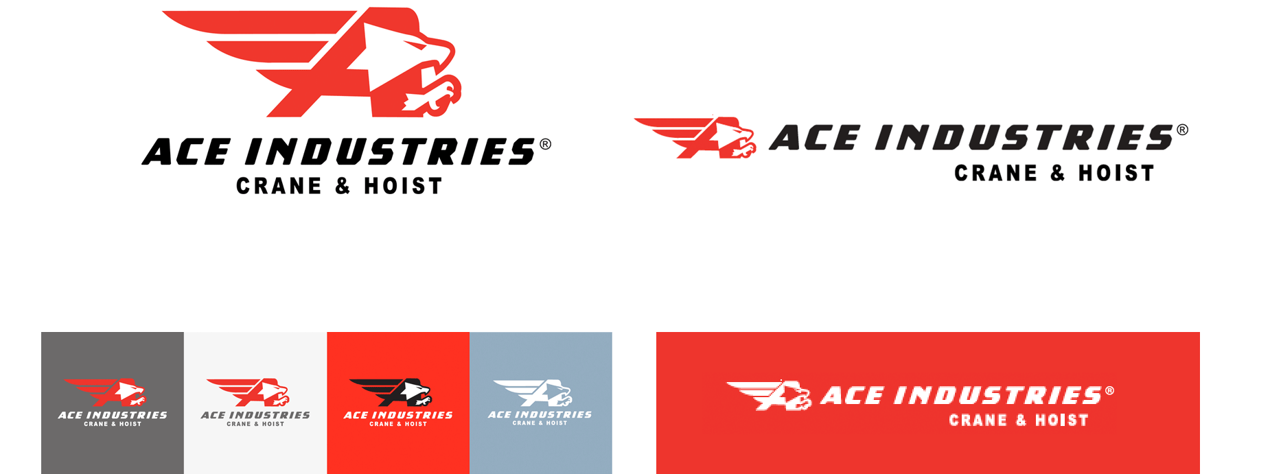
All they had was a very dated looking logo (left). I started by designing a new logo blending the "A" from Ace with an attacking eagle who as a fierce, dominant competitor garners respect, a natural symbol for American-made, an important status for the target audience.
Website Re-design
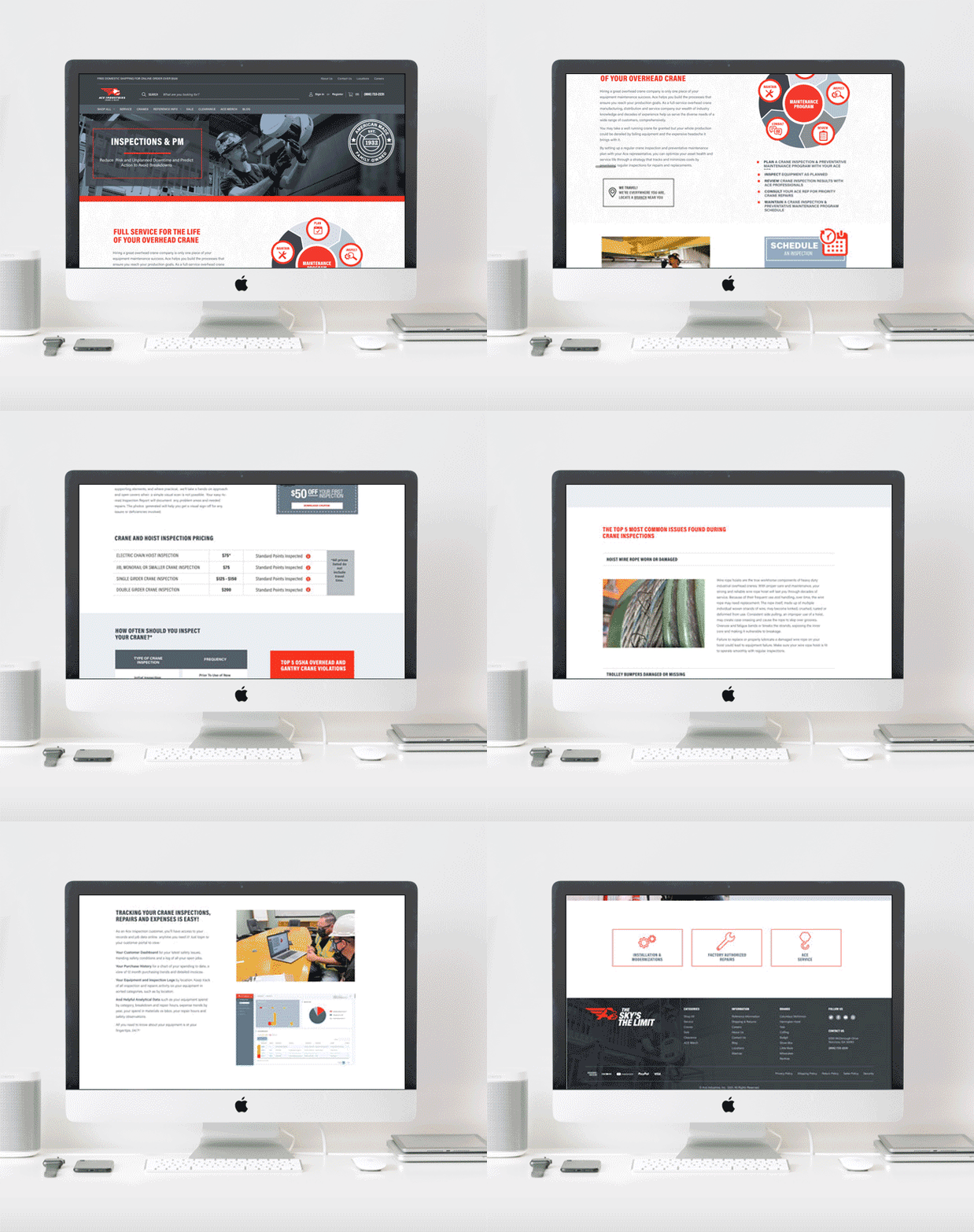
The legacy company website, functioning as both an eCommerce hoist & crane parts store and face of the business, was another dated relic with a hodge-podge of design styles due to having no single administrator.
With a new Big Commerce platform I designed the look and feel to exemplify the new branding with updated color palette, modernized look, improved UX and menu organization, copywriting with a brand voice and engaging, useful content. My own photography of manufacturing and service staff is used throughout the site to put a face to the business.


Messaging
I was tasked with unifying a company with a strong HQ culture but where the employees in satellite branches spread around the country operated within their own smaller, micro-cultures.
I facilitated a branding workshop and other working sessions for executive leadership to form the foundation of the company value system, develop a core mission to rally behind and their vision for the future. I wrote the company creed based on my observations of work culture at Ace to provide a source of pride and motivation. These principles convey to every employee the operating belief system in which they are expected to conform for harmony and success.


